Glassmorphism Circle Loading Animation
In this article we are gonna build a loading spinner with the glassmorphism with transform rotations.

Jatin Sharma
Nov 1, 2021
2 min read·205 words
In this article we are gonna build a loading spinner with the glassmorphism, stay tuned for that first let's look what are we building -
Preview
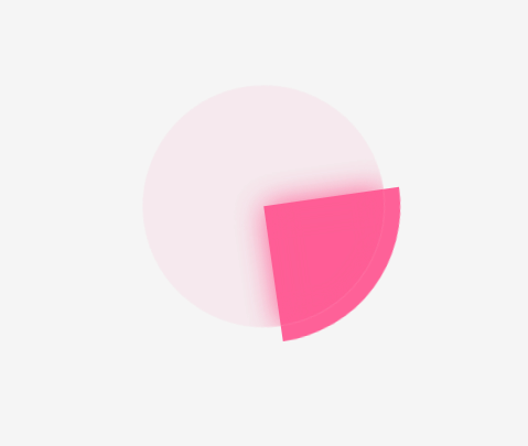
We just need simple div to create this animation. For this animation we have used pseudo classes and a normal keyframe in which we just rotate the .loader.
HTML
index.html
<div class="loader"></div><div class="loader"></div>CSS
styles.css
/* Main Loader */
.loader {
  position: relative;
  width: 180px;
  height: 180px;
  overflow: hidden;
  border-radius: 50%;
  animation: circleAnimation 1s linear infinite;
}

.loader::before,
.loader::after {
  content: "";
  position: absolute;
}

/* Glassmorphism */
.loader::before {
  inset: 10px;
  background: rgba(233, 30, 99, 0.05);
  border-radius: 50%;
  backdrop-filter: blur(10px);
  border: 1px solid rgba(255, 255, 255, 0.1);
  z-index: 1;
}

/* animated Circle */
.loader::after {
  top: -50%;
  left: -50%;
  width: 100%;
  height: 100%;
  background: #ff6198;
}

@keyframes circleAnimation {
  from {
    transform: rotate(0deg);
  }
  to {
    transform: rotate(360deg);
  }
}/* Main Loader */
.loader {
position: relative;
width: 180px;
height: 180px;
overflow: hidden;
border-radius: 50%;
animation: circleAnimation 1s linear infinite;
}
.loader::before,
.loader::after {
content: "";
position: absolute;
}
/* Glassmorphism */
.loader::before {
inset: 10px;
background: rgba(233, 30, 99, 0.05);
border-radius: 50%;
backdrop-filter: blur(10px);
border: 1px solid rgba(255, 255, 255, 0.1);
z-index: 1;
}
/* animated Circle */
.loader::after {
top: -50%;
left: -50%;
width: 100%;
height: 100%;
background: #ff6198;
}
@keyframes circleAnimation {
from {
transform: rotate(0deg);
}
to {
transform: rotate(360deg);
}
}Wrapping up
So after that, you can use it anywhere in your project. And let me know what do you think about it. If you like it then consider a follow, because I am gonna build more things like this.